Natisha Thiel
BRAND HISTORY
ABOUT
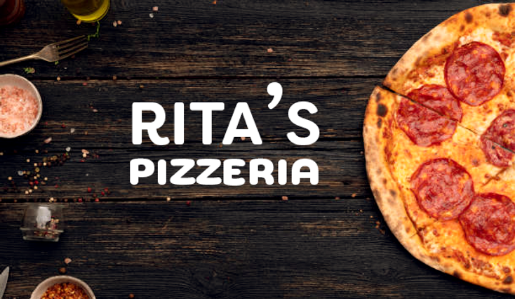
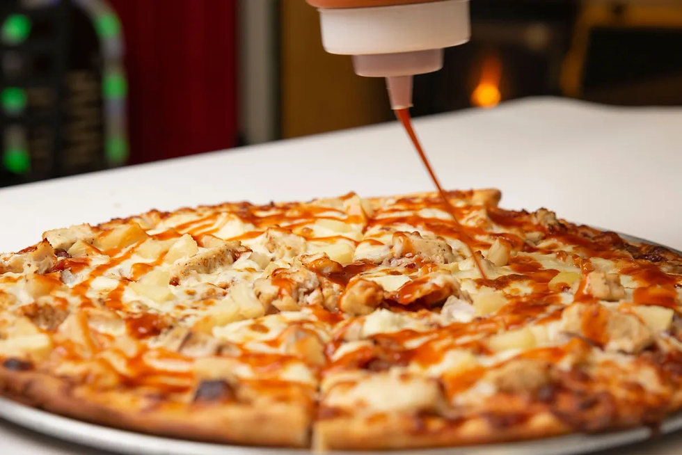
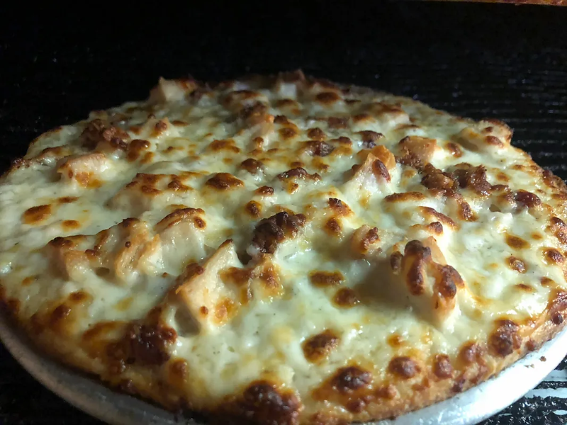
This beloved business is local to Clearfield, Utah and has been opened for over 25 years. This New York style pizza restaurant was started in 1993. This cozy store makes homemade pizzas from only fresh, high-quality ingredients. Along with their tried-and-true pizzas they also serve lasagna, subs, sandwiches, and wings. They are known for their quality sauces and the verity of spiciness it comes in. The merchandises they provide allows the community to share their pride and support with T-shirts and hats. This provides an additional benefit of a future discount when the merchandise is worn within their store.

LOGO & ICON
LOGO
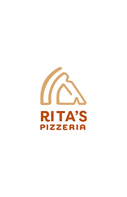
The logo of an abstract pizza slice is reminiscent of the old neon sign found in the early 90s.This is when the restaurant came into being. The simplicity of the logo also conveys the modern times in which it lives, a testament to the ages.

STANDARD DISPLAY
ICON DISPLAY
WORDMARK DISPLAY
RESEARCH
SWOT
Analysis
STRENGTH
Gives back to community
Unique spicy pizza sauces
Free delivery & affordable
Replies to online feedback
Friendly environment
Brand apparel
WEAKNESS
No dress code for workers
Getting their voice out
Weak online presence
Outdated website
Small business
OPPORTUNITY
Local business support
Small business funding
Currently rebranding
Claim online presence
Update website
THREAT
Main Chain’s advertisement
Job competition
Food shortages
Pandemic
ZAG
ANALYSIS
We are Rita’s Pizzeria, a local own small business.
Social media (Facebook), online search (TripAdvisor, Google, Yelp, etc) and word of mouth.
COMPETITION
BRAND ANALYSIS
DOMINOS
Logo type: symbol
TYPOGRAPHY ANALYSIS
Friendly, Homey, Geometric
RITA'S
Typeface name: Filson Soft, Bold
Designer: Olivier Gourvat
Year: 2009
Type Foundry: Mostardesign
Type Classification: Sans-Serif
PIZZERIA
Typeface name: Chennai, Medium
Designer: Insigne Design
Year: 2010
Type Foundry: Insigne Design
Type Classification: Sans-Serif
COLOR PALETTE